How to choose the right font for your labels
Make your label express as much as possible
It's not just what you say, but how you say it. And choosing the right font says a lot about your brand and products. That's why we've created a guide on How to Choose the Right Font .
The font you choose for your labels says a lot about your brand image. It's something you want to get right from the start. After all, you never get a second chance to make a good first impression!
We know that choosing fonts can feel like extremely hard work, especially when there are thousands of different variations to choose from, however, with our guide, you'll have more confidence in choosing the fonts that will work best on your label.


How to choose the right font
What is the personality of your brand?
Your label is more than just the text on it along with the graphics. The style, color and size of the text font is an extremely important thing in creating brand awareness. A font can help express a mood, create your own unique style, and even build an emotional connection with the buyer.
How do you choose the right font that does all this? First, you should really understand your brand's personality. Does it present itself as fun, trending, sophisticated, or perhaps corporate? Who might be looking for your product on store shelves?
Take all this into consideration before you delve into the world of fonts. Once you do, it will be much easier to find the right font or combination of fonts.
Create a clean, unobtrusive look.
We really like how the combination of a script font and a sans serif font makes the name "Honey" on this label stand out, while the rest of the information is clear.
Simplicity, elegance and sophistication
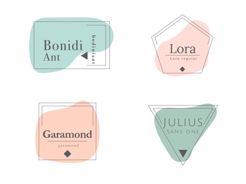
If you've decided to keep your brand simple and elegant, consider fonts with narrow lines that have a classic look. We think you might like these elegant fonts, which can be found in our free label design tool :
- Lora
- BodoniAnt
- Garamond
- Verdana
- Scada
- Scripts
- Poiret One
Natural, artisanal, with a rustical
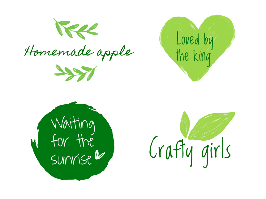
According to psychological research, handwritten fonts help customers get used to a brand. They give the impression of being friendly. Of course, they are not suitable for all brands or products, but perhaps they will work for you? Play around with creating a design using these handwritten fonts in our Design&Print software:
- Bella Donna
- Crafty Girls
- Homemade Apple
- LuedickitalD
- Loved by the King
- Shadows into the Light
- Sue Ellen Francisco
- Waiting for the Sunrise
Modern and bold
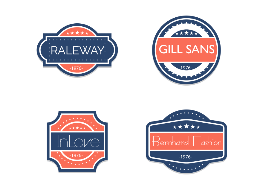
Simplicity prevails today, as it often appeals to larger audiences. That's why we recommend trying fonts that are more angular and uniform in structure. You can find these types of fonts in our label design and printing software:
- Raleway
- Gills San
- Bernhard Fashion
- InLove
- Poiret One
- Scada
- Endurance Pro
- Julius Sans One
Tips for choosing a font
Before you choose the right font, here are a few things to keep in mind:
- Know your audience. Figure out what and how to communicate to your customer, then choose fonts that will best fit your message.
- Choose fonts carefully - combine scripted or graphic fonts with simpler ones so they don't compete visually.
- Make each caption legible. After all, you don't want people mispronouncing your brand's name because a T looks like a Y in your chosen script font.
- Follow the rules. Make sure the font is publicly available or purchased and meets the legal standards for your product.
- Be creative. Don't be afraid to try different fonts with images and graphics. See which combinations will look best.
Pay attention to the hierarchy of information.
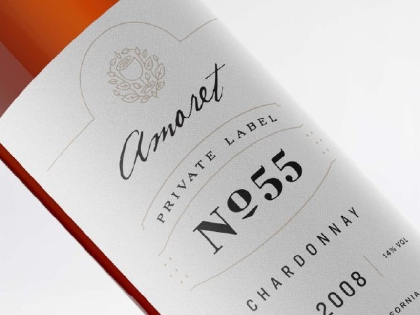
Using both script and graphic fonts helps the wine brand and name shine through. Simple fonts clearly display key information.
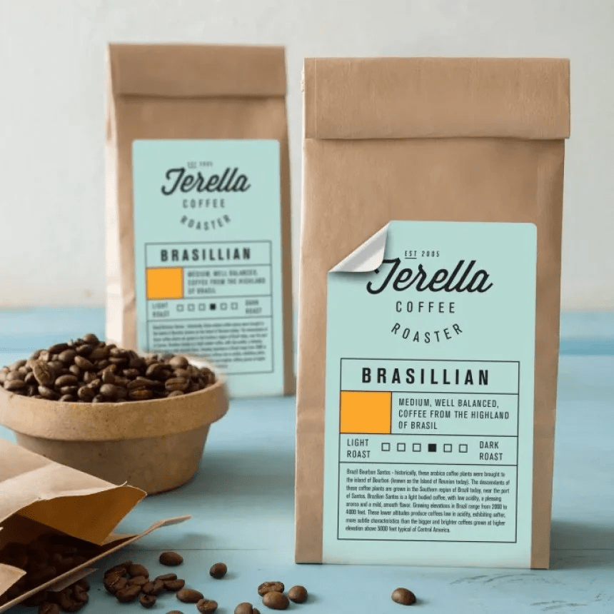
What message do different types of fonts convey?
Fonts are a very noticeable element and can tell you a lot about your company, brand or product in a subliminal way. Your first step should be to think about what will fit your product or brand, and what will appeal to your target audience:
Serif fonts - they are distinguished by small, decorative lines on the tips. They give a classic, traditional, exclusive, respected, authoritative, literary and warm look, e.g. Times New Roman, Garamond.
Sans-serif fonts - generally simpler and more readable, especially when texts are placed in fine print. These neat and modern fonts signify innovation, neutrality, reliability and professionalism, e.g. Arial, Helvetica Neue.
Script fonts - mainly used to achieve the look of handwriting or the effect of elegant calligraphy. These fonts often give a natural, rustic or feminine feel.
Graphic fonts - with their fancy and playful designs, these fonts can evoke an era, theme or atmosphere. They should be used with care and sensitivity.
The above two types of fonts work best for headlines or short messages. They should be avoided for long paragraphs or extended text: If you have already decided on a font for your logo, you should be sure to have a safe way to place it in headlines, messages, posts, etc.
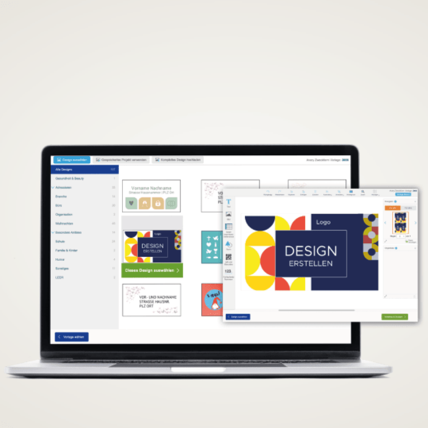
Avery Design&Print software
Create professional, personalized labels in minutes!
If you've managed to find the right font thanks to the tips above, it's time to add it to your label design. To do so, we encourage you to use our free label creation tool Avery Design&Print.
With it, you'll create product labels, address labels, shipping labels, inventory and labeling labels, and even business cards and badges, among other things.
Design&Print Online lets you design, edit and print the way you like - simply, quickly and directly in your browser, that is, without having to install external programs. You can save your designs in the cloud, in your Avery account, without downloading the program to your computer. This way you can access them anytime - on your computer, tablet or cell phone.